
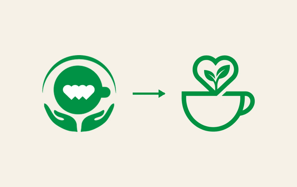
We're thrilled to introduce our brand-new website and refreshed logo — not just a visual update, but a marker of an exciting new chapter for the Association.
A clearer, warmer website
From the visual design to the content structure, our new site has been completely rebuilt. It's now easier to explore our vision, projects and volunteer programme — and we've greatly simplified the giving experience, with clear bank-transfer instructions, one-tap copy of the account number, a three-step donation flow, and a fully mobile-friendly design, so every gift can reach us with ease.
From a round emblem to the warmth of a cup
We've also redesigned the logo we've used for years. The original round emblem cradled a coffee cup in a pair of hands, a symbol of care and protection. The new mark evolves into a cleaner, more modern line-drawn coffee cup, with a heart formed of sprouting leaves rising from it — a sign of nurturing growth and sharing love and hope through coffee. Its simple lines reflect a more professional, more open new chapter for the Association.
Setting sail with you
This revamp is about helping more people discover and support us, and carrying our mission further. Thank you for walking with us — we can't wait to welcome you on this new platform, and to keep building a more inclusive community in the name of coffee.